Welcome to iPagePro Documentation
Check back often to get the latest tips & tricks for making the most of your iPagePro Website
- Contact Us and Get Help!
Mobile Styles
I have never been able to get the code that I put in the "Add Mobile CSS" box to work - what I do instead is create a media query and put all my code in that query
@media handheld, only screen and (max-width: 800px){ /*Mobile CSS Goes here*/ }
All mobile code can be placed in that one media query - there is no need to create a new one for each piece of CSS. The only time that you would create a new media query is if you are creating one for a new size
@media only screen and (max-width : 320px)
{ /*Mobile CSS goes Here*/ }
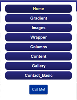
Nav Bar CSS | No Background | Call Me (Maybe?) Button |
Nav Bar CSS
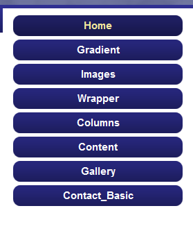
If your Nav Bar looks like this:
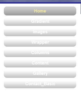
It Needs to be Fixed!
@media handheld, only screen and (max-width: 800px){#nav ul li {background-color:#26267A!important} }
Remove background Image on Mobile
You don't really need to have your custom background image show on mobile view - to remove it just add the following code to the media query:
body {background: none !important;}
Client wants a click to call button show up on mobile view only
Ok - so this is actually a pretty neat little trick - let's say that a client wants a button that shows up ONLY on mobile view where clients can then click to call. I usually stick these buttons in the banner area ABOVE the banner, but you can also include it above or below the header image as well.
HTML

CSS
.callme {visibility: hidden;}
@media handheld, only screen and (max-width: 800px) { .callme {visibility: initial;} #banner { margin-top: 13px; } }